Emails to get Responsive - A Way forward for Digital Marketing
Mr. Sharma is seated at his office during the busy morning hours of a Monday. He has a meeting to attend in 5 minutes and had no time to check some important mails. He being an avid shopper, wanted to check his mails for some offers. Hence he looks into his smartphone and tries to get a quick look at some important mails. He is one of the many who have got into this trend of using their mobile phones for checking emails and hence giving a tough time to the email marketers.

Image Courtesy: freedigitalphotos.net
Digital marketing is forging a new relationship between technology and marketing. In a world that is still reeling under the effects of the economic slowdown, it is still the buzzword for everything from start-ups to multinationals. Not only is the cost of digital marketing lower, it is provides instant service and ensures effective and interactive two way communication along with feedback. Over 41 percent companies say corporate website, digital advertising and social networking are key to their marketing success. Among the various digital marketing tools used by marketers, email marketing has emerged over the years to be a low cost yet highly successful means of targeting the masses.
EMAIL MARKETING
Email marketing is used in a number of ways by organizations and marketers for company advertisements, building brands , building customer loyalty, acquiring customers and communicating promotional offers .With email marketing, you can easily and quickly reach target markets without the need for large quantities of print space, radio time and television, which involves high production costs.

Thanks to effective email marketing tools and software, with it one maintain an updated email list which can be segmented based on several factors of customers’ likes and dislikes, consumer spending habits and other important criteria. Emails are then created on platform and sent out to specifically target members of email list, providing them with information of their interest. Feel of personalization helps promote trust and loyalty among customers while also increasing sales.
Tools like MailChimp can help us design email newsletters, combine with services you already use, share them by email and track results. It is like your own personal publishing platform. You can easily monitor how effective a marketing campaign with the help of web analytics tracking tool, and see that your return on investment. Through efficient use of email marketing, while targeting new markets current clients can be retained.
Leading companies like Unilever have been highly successful in implementing this tool. Their brand Dove has been labelled as genius marketing brand for the use of email marketing and social media marketing for the launch of Dove men + care.
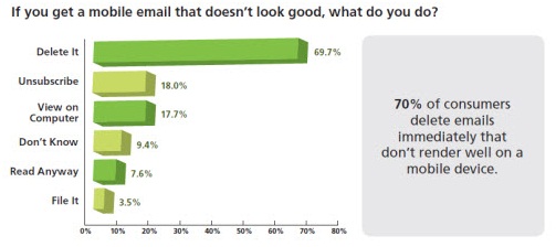
These have been there for quite some time. What is new is mobile email marketing. Today as user prefer to view information on the go, they are moving from desktop computer to mobile devices for checking mails. Research shows that about 49% of people across the world use mobile phones to open their emails. The usage of desktops to access emails has dropped by 44 % and about 63% of people delete their emails, if it is not optimized for access from a mobile phone.
By 2017, eMarketer expects, 36.3% of digital ad spending around the world will go toward mobile formats, up from just 4.6% as recently as 2011.The extensive use of mobiles for checking emails has evoked the need for responsive designing.
RESPONSIVE DESIGNING
Responsive design is a set of modern tools and techniques aimed to rearrange the way information is displayed depending on the design capabilities. It focuses on designing an email, considering the requirements of all types of devices as a result of which the user gains an optimal viewing experience.
Responsive design allows you to present your content at its best. The result is there won’t be any resizing, scrolling and panning. So all in all ‘ right experience for the right screen at the right time’ is the marketers definition for responsive design.
Mobile email clients often try to scale down the emails to fit into smaller screens. This results in messages that come in small fonts and are very difficult to read. While iOS devices automatically scale down all emails. So for the other devices the marketer has to consider this aspect of designing aesthetically pleasing emails.
How is responsive designing done?
Designers cannot rely on any one unique layout solution anymore. The key is in the response which means getting information about the device, reacting and displaying an adapted version of the layout. Designing or sending emails designed specifically for mobile users is very important now a days. Dealing with the design challenges for mobile email we have a small screen with a touch interface and many older mobile email clients lack proper support for media queries. To design a campaign that works well on both desktops and mobiles, use media queries where they are supported to dynamically add an extra layer of optimisation for smartphones.
It requires application of some techniques like media queries, fluid layouts and images to make emails that are suited to both desktop and a mobile. These techniques allow a designer to hide, expand or collapse certain content to enhance content display on smaller screens. It involves designing large buttons for easy tapping and hiding unnecessary content.
The responsive design method dynamically adapts the content and layout of an email depending on the type of device on which it is being viewed, desktop or mobile device.
Web designers take a ‘design-first’ approach to their projects. For building a responsive template it is recommended to use Inline Style Sheets (ISS) over its External and Embedded CSS. The reason for this is that most web-based email client’s strip out any External and Embedded style sheets from the email header resulting in the final email are being displayed incorrectly using the default browser fonts. ISS, however, performs much better. One key difference is that building a responsive template email for mobile devices requires the use of CSS3 media queries.

Coding template is done to adapt the rules based on device resolution. Code is designed stating the maximum resolution size, width etc. If device is having a maximum resolution of 480 pixels or below, the email is viewed on a mobile device. For device using a bigger resolution the media query can then be adapted based on a number of potential resolutions using different style sheet rules.
The coding should be perfect since improper coding leads to unnecessary downloads and slow down of mobile phones. Extensive testing of the design across various platforms is really essential in order to check how the layouts fit in different devices.
Marketers should remember that an email is not the final platform, but it should ultimately get the user to its website. So effective display and content presentation are the key goals here. Some of the simpler but necessary elements email designers must look into are stated below.
1. Design for small screens
Implementing responsive design can start with designing for mobile first. For this, marketers have to cut their content and focus on the most important points. The key objective is to design the small screens to make them user friendly.
2. Layout and size
Vertical and horizontal layouts must be arranged carefully. Design must be such that fonts are legible on all screen sizes. Down-sizing must be avoided and emphasis must be on important content and key elements.
3. Content focus
Any content not relevant or important to users must be removed. All options that users use frequently should be arranged on the screen. Marketers must give a thought to what would be most likely viewed on a mobile. CTA’s should be visible and must be of good size.
WAY FORWARD
Studies show that responsive designing has boosted click through rates by 63% and transaction rates by 18%. Many companies have already gone responsive with their emails, including Vodafone ,Monster and Twitter. The scenario shows that now is the time every company seriously optimizes their mails for mobile and design mails that are of good quality for both desktop and mobile.
To enhance the user’s shopping experience we can take advantage of the unique abilities of mobile and tablet devices such as location-based GPS, accelerometer and multi-touch. Tools like mailchimp, responsive email template can help you design template that can provide rich experience to user and engage them for significant activity on devices.. JPEGmini can dramatically reduce the size of the images. You can reduce the weight of image upto 80% by few simple clicks without sacrificing on quality.
Assume that many users will be looking at sites on 56k modems or slow 2G mobile networks on smartphones. To cut load time a collaborative effort between can be done between developers and designer to reduce complexity and weight on mobile device by trimming down JavaScript and following best practices for front end development.
With scalable, flexible and responsive email design option we can allow to deliver the right email experience on any sized screen, from smartphones to desktops. So the question is ‘Are you responsive?’
This article has been authored by Gautam Malhotra And Harshita Preetam from Great Lakes Institute Of Management
References:
emarketer.com
online.wsj.com/article
blog.eloqua.com/email-marketing-2/
econsultancy.com/in/blog/62019-seven-tools-to-optimize-your-email-marketing-for-mobile
marketingland.com/infographic-optimizing-email-marketing-for-mobile-devices-41714
{jcomments off}
Views expressed in the article are personal. The articles are for educational & academic purpose only, and have been uploaded by the MBA Skool Team.
If you are interested in writing articles for us, Submit Here
Share this Page on: