Bar Graph - Definition & Types
What is Bar Graph?
Bar Graph is pictorial representation of statistical data in such a way that length of the rectangles in the graph represents the proportional value of the variable. Bar Graphs are generally used to compare the values of several variables at a time and to analyze data. The length of the bars (horizontal or vertical) represents the frequency of the variable and is applicable to discrete values only.
Types of Bar Graphs
The different types of bar graphs are:
1. Single Bar Graph – Such graphs are used to represent discrete value of each variable drawn in opposite axis.

In this graph, we can see that bars represent values of discretevariables X, Y, Z in y-axis.
2. Grouped Bar Graph – Such graphs represent values of more than one variable in the very same category. Rectangular bars are stacked side by side and they are color coded to distinguish themselves.
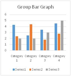
In this graph, we can see that blue, orange, grey colored bars belong to same category which are stacked side by side and are representing their respective frequency.
3. Stacked Bar Graph – Such graphs have bars subdivided into parts which represents the discrete value for the variable that represents the portion of the bar.
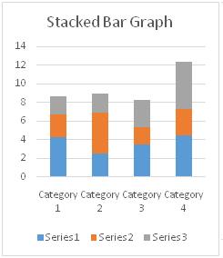
In this bar graph, we can see that blue, orange, grey colored portions in each bars representing series 1, series 2, and series 3 respectively belong to different categories and represent respective values in y-axis.
Hence, this concludes the definition of Bar Graph along with its overview.
This article has been researched & authored by the Business Concepts Team. It has been reviewed & published by the MBA Skool Team. The content on MBA Skool has been created for educational & academic purpose only.
Browse the definition and meaning of more similar terms. The Management Dictionary covers over 1800 business concepts from 5 categories.
Continue Reading: