Top Logo Rebranding Strategies of Companies
The one thing that will never change is that a change will happen in life! And this why in the world of business, even the most popular of brands have undergone evolution, in terms of their logos and customer perception. Here is list of the famous and unique logo transformations of 55 of the world’s biggest brands!
1. Pepsi
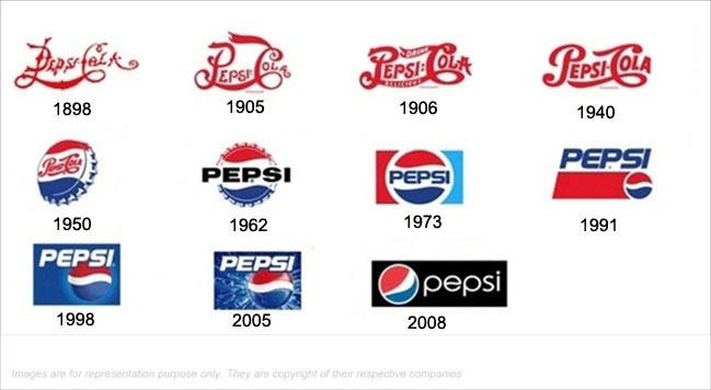
Beverage giant Pepsi has rebranded its logo from a simple text of Pepsi Cola to a more colorful logo within a circle to a more computer-generated 3-dimensional sphercial logo with droplets added. This shows that even a top-of-the-mind brand like Pepsi has to keep up with the time and rebrand itself constantly.
2. Coca Cola
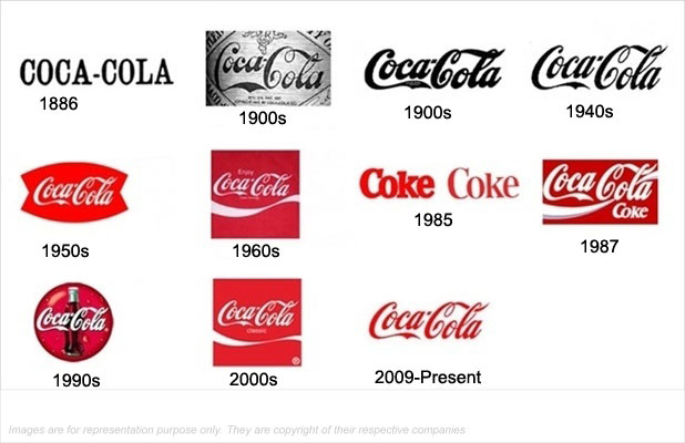
Coca Cola over the years has evolved into a more colorful and vibrant logo as compared to the simple text logo. In between, the Coca Cola Coke brand logo was also there before the classic logo again started making waves and thereby re-established its position as a high brand recall logo
3. Shell
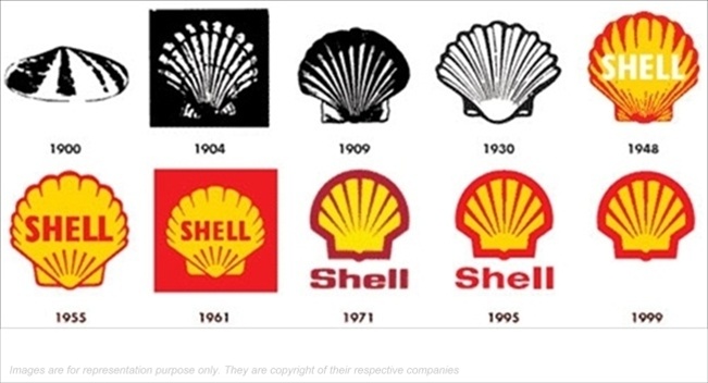
Oil giant Shell has changed its logo from a realistic black n white logo to a more colorful and a bold logo in recent times. After the first 30 years, colorful logos were introduced, and now so much is the brand recall, that the title "Shell" has been removed and the brand is recognised from its red-bordered-yellow-shell shape.
4. Visa
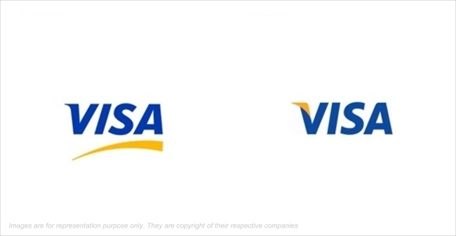
Visa re-branded and refurbished in perception by changing its logo into a more crisp logo which was introduced alongwith the new governance structure and new brand architecture of the organisation
5. Apple
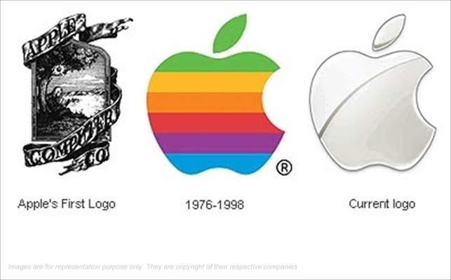
Just like Steve Jobs took the world by storm with innovative products everytime, it was coupled with logo redesigns, which shifted the company's perception with changing times. The Apple logo was redesigned from a colorful striped bitten apple to a more professionally carved 3-d logo which gave a more futuristic look, which complimented its innovated iPhone and iPad products
6. KFC
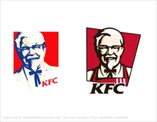
In a space of 40 years, KFC changed its logo 4 times. The new logo has a sharper look compared to the previous design and the Colonel Sanders bow-tie replaced by the apron shows a more definite relation with the fast food giant.
7. Adidas
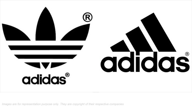
Sports equipment and apparel giant completely overhauled its logo and introduced a new looking design. Adidas logo, representing the durability and elegance, is a three parallel striped design that symbolizes the mountain which is to point towards the goals and challenges that lay ahead.
8. Mastercard
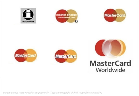
Mastercard tweaked its logo keeping the two-merging golden and red circle as the main base. The merge of the two circles was more fluidic and shows a smoother relation between the customers and the organisation, apart from a global presence represented by the third circle
9. BP
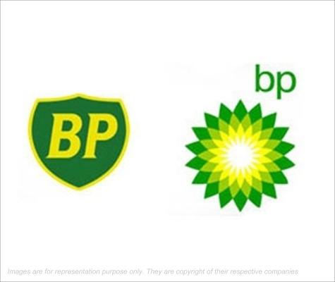
Pertoleum major had a significant change in its rebranding and remaking its logo. The new green, white and yellow logo which replaced the BP shield, was designed to show the company's commitment to the environment and solar power. A new vibrant approach also made the companys look and feel more customer focused and contemporary
10. Intel
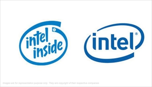
Intel's positioning as a consumer-oriented, digital media platform provider rather than merely a supplier of CPUs and components for other manufacturers, led to the redesign of their logo. The moves are intended to pull diversified business towards Intel alongwith the overall worldwide market growth for personal computers
11. Starbucks
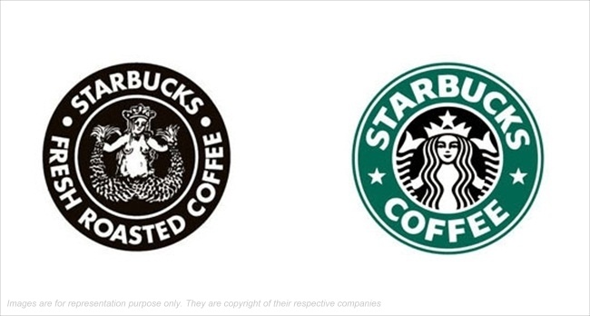
The basic premise of the globally recognizable Starbucks has not changed. However, the logo has been rebranded by removing the words 'Starbucks Coffee'. This is because the logo already has a definite perception in the consumers mind and it also gives an opportunity to diversify into other beverages apart from coffee.
12. Audi
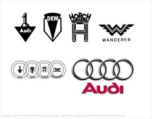
German car manufacturer Audi, has seen its logo completely transform since the inception of the brand. The drastic changes in the logo have appeared over the years but the latest modern 4-ring logo with a 3d steel finish and "Audi" name is red, leaves an everylasting impression of a premium automobile brand
13. Ford
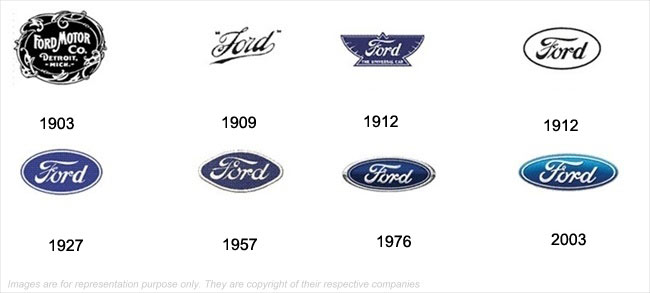
The world's first car manufacturer has changed the way the world travels. The first logo was a black-n-white logo which was converted to a cursive-italics-stylised text. Encircling the brand name in an oval and giving a blue background became the logo, which is currently given a 3d shiny look and defines the depth and style of the brand
14. BMW
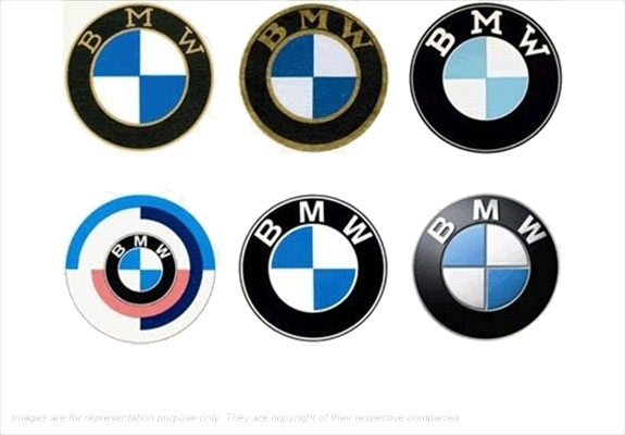
German premium and sports car manfacturer BMW has kept its logo more or less but has over the years just slightly modified it. The circle with alternate blue-white quadrants surrounded by BMW brand name remains the same, but the new logo is stylised with depth, shine and a more futuristic and fashionable sharp finish
15. AT&T
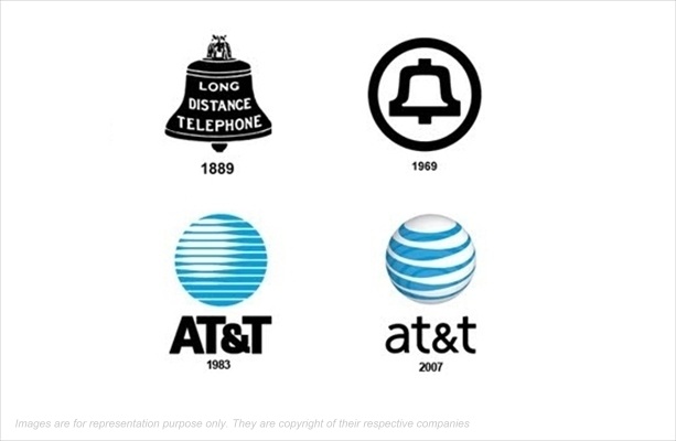
Keeping pace with the changing times, telecom player AT&T changed its logo with the minimum of modifications. The 2-d blue and white striped logo was converted into a 3-d spherical logo, which gave a more futuristic and comtemporary look and feel, and add to that the lower case text, it converted the earlier image of the logo into a more sophisticated image.
16. Nike
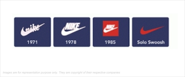
The most popular "Nike" swoosh logo has always been the same with minor changes. Earlier the brand name was embossed along with the 'tick'. But now, such powerful is the brand recall and the presence of this power brand, that a simple "swoosh" speaks volumes about the brand Nike.
17. BT
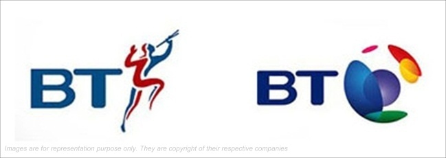
The earlier piper was replaced with a 'connected world' image which was a 'visual identity change', its first since 1991 and only the second since it became British Telecom in 1980. BT said its new look "reflects the wide range of activities that BT now encompasses".
18. Walmart
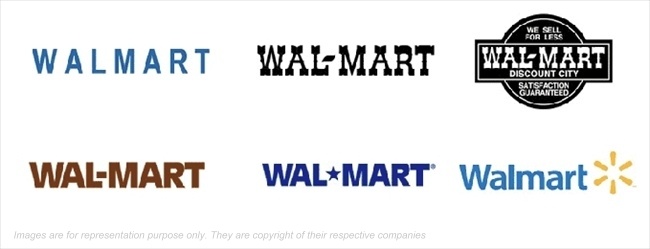
Retail giant Walmart changed there logo to a more colorful and vibrant logo. Also, along with the logo, the tagline "Save Money. Live Better" was added, which re-establishes the value proposition for the customers that with a brand like Walmart, there lives would become better at an afforable price
19. Videocon
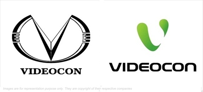
Videocon has undergone a striking change in its logo with more colorful curvy and contemporary looking "V" compared to its earlier and simpler brandname. Such a move opens the horizon for Videocon to encash on its brand recall through logo and also diversify
20.Xerox
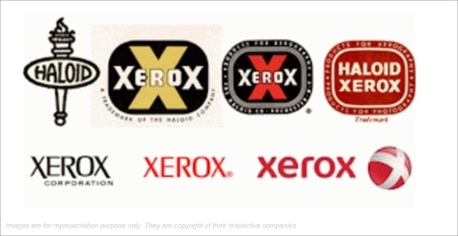
Xerox transformed its simple bold logo into a more stylised 3-d effect logo and also added the global sphere with an "X", which has not only enhanced the logo, but also gives an opportunity to stamp the brand identity without explicitly mentioning the brand name
21. Fiat
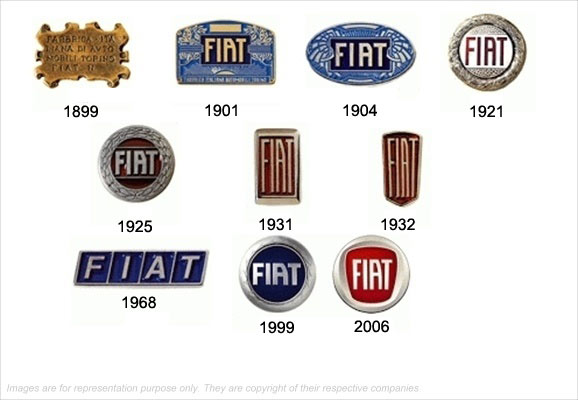
The logo of FIAT has undergone some of the major dramatic changes with time. After making significant changes, the final FIAT logos are enclosed in a circle with a 3d depth look and feel, the maroon background with the silver finish gives a classy premium feel
22. Renault
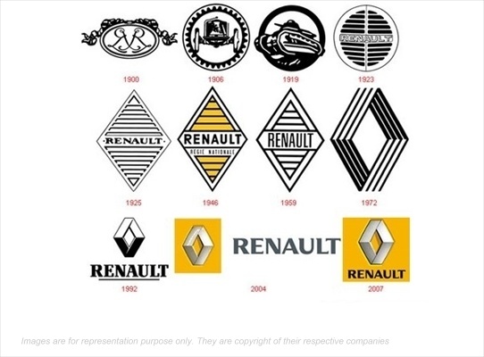
One of the most unbelievable logo transformations is of Renault. Froma black and white circluar logo to changing its shape to a "diamond" to adding golden color and the the brand name "Renault", its logo has become one of the worlds most widely recognised images. The current logo gives an extremely neat shiny and colorful, which appeals a lot to the customers
23. VW Volkswagen
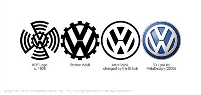
The journey of VW as an automobile brand has been complimented with a consistently evolving logo. With "VW" of the logo remaining constant, the color has been tranformed from a black and white logo to a complete blue colored contoured 3d logo, which more appealing and goes well with the stylish cars made by VW
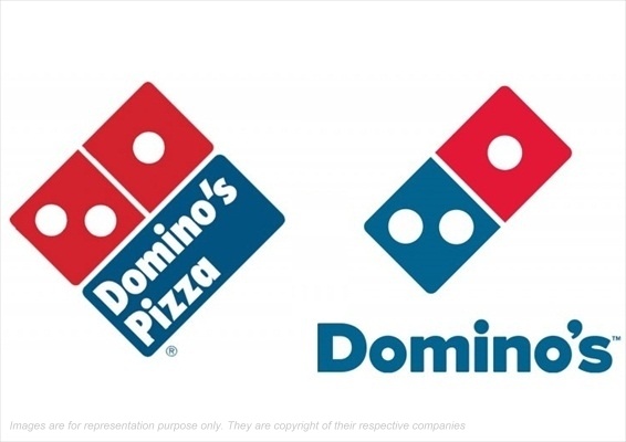
24. Dominos
Pizza brand Dominoes didnot make a major change in its logo but just empahsised more on the logo and lesser on the brand name and keyword “Pizza” as the logo had already become a brand recall attribute as a global inconic brand
25. Pizza Hut
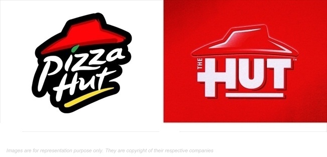
Pizza Hut experimented with its logo by modifying it by removing the 'pizza' keyword from the logo. However, the hut was left alone as it already has established itself like a global icon
26. Nokia
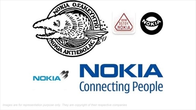
Leading mobile handset manufacturer Nokia, underwent a series a changes in its logo. What started as a B2B professional logo, Nokia converted its logo into a colorful image and ultimately the "two shaking hands" with the brand name became a household name of its tagline "Connecting People"
27. Nestle
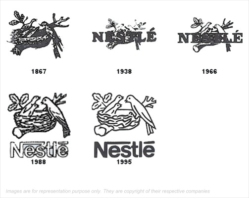
Evolution of Nestle's logo has been a gradual process. With the earlier logos focusing on the nest, the addition of the trade-mark birds in the nest alongwith the bold Nestle brandname, the logo is easily a top-of-the-mind feature for the brand recall