- Business Concepts ›
- Marketing and Strategy ›
- Tornado Diagram
Tornado Diagram
Definition & Meaning
This article covers meaning & overview of Tornado Diagram from marketing perspective.
What is meant by Tornado Diagram?
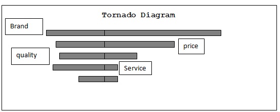
It is a bar chart which assesses all the factors individually which are affecting the dependent variable. The representation of the chart is done on a vertical axis instead of the conventional horizontal axis . The values are selected in such a manner that their magnitude decreases in a descending manner as we move down the axis. It helps us in relative comparison of the variables.
Example : While assessing the affect of an individual factor rest all the factors remain constant . The values are selected for a given band 10 % to 90% variation and the results are plotted for the (10%-90%) variation in factor 1 and values obtained from the expression for factors 2 , factors 3 …factor n are plotted and compared .
The cumulative percentage of deviation on our dependent variable is explained using Tornado Diagram.
The above diagram mentions the effect of 1) Brand value 2) Price 3) Quality 4) Service on the sales of a consumer non durable . We can notice as the perception about the brand becomes positive has maximum effect on sales thus this is the strongest driving factor . The service is least significant factor driving the demand for the product.

This article has been researched & authored by the Business Concepts Team which comprises of MBA students, management professionals, and industry experts. It has been reviewed & published by the MBA Skool Team. The content on MBA Skool has been created for educational & academic purpose only.
Browse the definition and meaning of more similar terms. The Management Dictionary covers over 1800 business concepts from 5 categories.
Continue Reading:
What is MBA Skool?About Us
MBA Skool is a Knowledge Resource for Management Students, Aspirants & Professionals.
Business Courses
Quizzes & Skills
Quizzes test your expertise in business and Skill tests evaluate your management traits
Related Content
All Business Sections
Write for Us