- Business Concepts ›
- Operations and Supply Chain ›
- Gantt Chart
Gantt Chart
Definition & Meaning
This article covers meaning & overview of Gantt Chart from operations perspective.
What is meant by Gantt Chart?
Henry L. Gantt, an American specialist and a social researcher developed the concept of Gantt chart which is a flat bar graph created as a production control tool in 1917. Generally used for project management, a Gantt outline gives a graphical representation of a calendar that serves to arrange, facilitate, and track particular assignments in a project.
Gantt charts illustrates the beginning and the completion dates of the terminal components and outline components of a particular project. Terminal components and outline components constitutes the whole work breakdown structure of the project. Cutting edge Gantt diagrams additionally demonstrate the reliance (i.e., priority system) on relationships between exercises. Gantt diagrams can be utilized to show current timetable status utilizing percent-complete shadings and a vertical "Today" line.
Gantt outlines may be straightforward forms made on graph paper or more mind boggling automated versions made utilizing project management applications, for example, Microsoft Project or Excel.
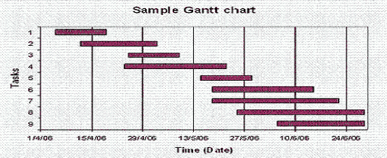
A Gantt diagram is developed with the horizontal axis representing the total time duration of the project, separated into increments (for instance, days, weeks, or months) and the vertical axis illustrating the task which constitute the project (for instance, if the project is furnishing a computer with new programming software, the real assignments included might be: conducting research, pick the programming software and installing the software). The horizontal bars of different lengths represents the groupings, timing, and time span for every task. Utilizing the same case, we would put "behavior research" at the highest point of the vertical axis and draw a bar on the diagram that measures the time we hope to spend on conducting the research, and after that enter the other task of the project underneath the first and bars representing the time when we hope to attempt them. The bar spans may overlap each other, as, for instance, we might choose a software while conducting a research simultaneously at the same time span. As the project advances, auxiliary or secondary bars, arrowheads, or darkened bars may be added to show finished assignments, or the portions of the task that have been finished. A vertical line is usually used to represent the report date.

Example
Gantt diagrams give a clear outline of project status, yet one issue with them is that they don't show assignment conditions – we can't tell how one task is falling behind its schedule which ultimately affects different other tasks. The PERT chart, another prevalent project management charting method, is intended to do this. Automated Gantt charts store more data about tasks, for example, the people allocated to particular tasks, and notes about the strategies. They additionally offer the advantage of being anything but difficult to change, which is useful. These charts may be adjusted often to reflect the genuine status of project status as, definitely, they deviate from the previous original plan.
Hence, this concludes the definition of Gantt Chart along with its overview.
This article has been researched & authored by the Business Concepts Team which comprises of MBA students, management professionals, and industry experts. It has been reviewed & published by the MBA Skool Team. The content on MBA Skool has been created for educational & academic purpose only.
Browse the definition and meaning of more similar terms. The Management Dictionary covers over 1800 business concepts from 5 categories.
Continue Reading:
What is MBA Skool?About Us
MBA Skool is a Knowledge Resource for Management Students, Aspirants & Professionals.
Business Courses
Quizzes & Skills
Quizzes test your expertise in business and Skill tests evaluate your management traits
Related Content
All Business Sections
Write for Us